Online software Learning
 The other day someone asked for different ways to present simple screencast videos. They didn’t want an elaborate production process. Instead just a few ideas to help them change up the way they’re currently doing their screencasts for their online software training.
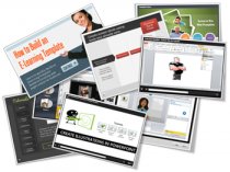
I regularly put together simple screencast videos. Sometimes I’ll play with different ways to present the information. Below are a few examples from the blog over the past couple of years. I highlight some of the things I did to mix it up a bit.
Not All Software Training Needs to Be Video
In the example below, I demonstrated how sometimes it’s easier to use static images to teach about software than creating a video. Some of the benefits of this approach are smaller file size, easier updating, and less production time.
This example was built in PowerPoint. So if you don’t have a different application, you can still create some simple interactivity that mirrors the software training.
Speed Up Production with a Form-based Software Training Application
Form-based tools are nice because they make production super simple. All you do is add your content to the form. This can be text, narration, images, or video. And then you hit publish. The software does the rest because it’s already designed to do something very specific. That means fewer decisions for you and a faster production time.
In the demo above, I used an image of the software I was training (in this case Articulate Storyline). Then I inserted some labels on top of the image to highlight features of the software.
This demo has three labels to show what you can do:
- Text only: the easiest to do
- Image & narration: added a more detailed image to dig deeper and recorded some narration to explain more
- Video screencast: which lets me chunk up the video part of the training into smaller and more targeted videos.
Below are a few tutorials that I’ve done in the past. They’re mostly video screencasts. But sometimes I like to mix up how I present them. This way I can play with ideas on the look and layouts. I also try to add some interactive elements if I can.
Software Training: How to Customize a Free PowerPoint Template
In this example, the main page mirrors the free PowerPoint template. I broke the tutorial into three chunks and used the circles as a menu.
You’ll also notice that once complete, the circles indicate a visited state to show that the tutorial has been viewed.
Software Training: How to Crop Images in PowerPoint
Here is a somewhat different take on the tutorial page. I was playing around with some drag & drop ideas where the end user selects a video and drops it in a box which loads the video.
It’s easier to build a simple click interaction to play the video tutorials. But sometimes the contrast of doing something different (like a drag & drop) helps engage the person during the training.
Original posts:
Software Training: How to Build an E-Learning Template
In this example I start the tutorial with a simple page that explains the series of tutorials. The first tutorial just goes to just the video. For the second tutorial, I added a start image with the idea that you can quickly brand or describe the video prior to clicking.
More:- In case you're interested in knowing more info on make money online, stop by https://earnwith.me
You might also like


